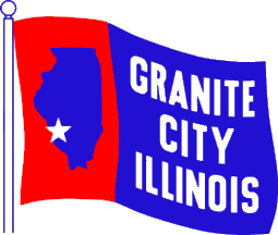
In this case.....I am talking about the flag of the City of Granite City, IL.
It's due for a re-design....
This one isn't a beauty, but still looks somewhat nicer:
This one is near perfect. It's classic, and you don't even have to be told what it represents...because it's iconic:
This is another example of a good flag... iconic, but not as familiar to Southern Illinois, but still recognizable to many:
Ugly --- Wrong direction:
One of the most impressive outside of St. Louis and Chicago is this one....from Centralia, IL. Though it's not as recognizable, it's still iconic and not too busy:
SO anyway, Granite City....do a flag redesign. Try something iconic, not just the cartoony bucket of molten steel, but to really work with it...
Don't feel bad, Granite City....the state flag of Illinois really stinks and should be redone as well.
I just think a good flag has no words, but tells the story in a simple but iconic type of design.

 on April 21, 2020, 11:33 pm