![]()
 on 7/22/2021, 8:39 am, in reply to "From 2018: The "TOUGH SH*T" noir festival (per the noir-o-meter) revisited..."
Here's a graph with a lot more of the Noir-o-Meter DB covered, using the same measurements for the axes, working the same way, AND with the DB averages drawn in for "character element toughness" (the green horizontal line) and the MELO RATE (the red vertical line).
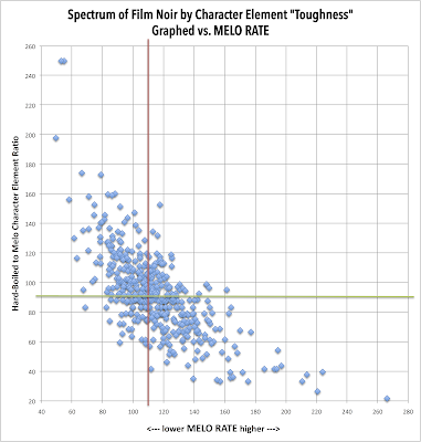
Again, "toughest" (hard-boiled) noirs in upper left quadrant, "most tender" (melo-noirs) in lower right quadrant. And we might just figure out what's with the ones in the lower left and upper right--probably films balanced but with more/less of raw noir score--we may find highest raw scores in that upper right quadrant. At least that's my guess for now.
That gives you a real good sense of the distribution. There are, of course, many other ways to further slice and sort this data, including by raw Noir-o-Meter score, by values within individual noir elements, and so on. We'll get back to that here again, but for now consider this to be another set of steps into and beyond the "proof of principle" phase...
Responses