![]()
 on 6/29/2021, 10:54 am, in reply to "Re: From 2017-18: Noir Top 25 Poll--Solomon's updated ratings; we prove it's not too late for tiers"
Here we show Mike's idea for a way to correlate "noir-o-meter" with "general quality" of the films, followed by my approach using a scatter chart approach using a subset of the films shown at Noir City that are tied to the Top 25 poll. This is followed by Mike's response, and my second correlation chart that substitutes the "Quality Score" for the ranking in the Top 25 poll.
Re: High Maltin ratings but not in Blackboard's top echelon
Posted by Solomon on 1/3/2018, 11:52 am, in reply to "Re: High Maltin ratings but not in Blackboard's top echelon"
Don, here's what I'd like to see you do. For the BB top 100, you already have ranks. They include a lot of ties. That's a challenging statistical issue. You can bypass it by assigning ranks randomly using the alphabet. Hollow Triumph and Strangers on a Train are both 33. Make Hollow 33 and Strangers 34 (earlier letters come first, H before S). T-Men and Pickup are both 35. Make Pickup 34 and T-Men 35. Act of Violence and brute Force are both 42. Make Act 42 and Brute 43. This method introduces a small amount of error but is simple to implement.
Dead Reckoning 46
Sweet Smell 47
The Chase 48
Shield 52
They Live 53
Fallen Angel 54
Kiss 55
High 56
Odds 57
Crime 58
Shadow 59
Force 60
Human 61
Border 64
Lady 65
Body 66
Highway 67
On Dangerous 68
99 River 70
Cry 71
This Gun 72
etc.
You'll end up with 96 lines, unless my file contains a shortened list for some reason.
Next, take the noir-o-meter scores for these films and arrange them from high to low. Assign the rank 1 to the highest score, 2 to the next highest and on down to 96 to the lowest. Finally do a correlation of the BB poll ranks with the noir-o-meter ranks.
The null hypothesis of no correlation is that the BB voting and the meter scores are unrelated, which would mean that the BB notion of quality is not the meter notion. If this null can be rejected, it will probably be because of a positive correlation. You can also do the same kinds of correlations for the components of the noir-o-meter total score.
A partial correlation chart [was: Re: High Maltin ratings but not in Blackboard's top echelon]
Posted by Don Malcolm on 1/7/2018, 3:08 pm, in reply to "Re: High Maltin ratings but not in Blackboard's top echelon"
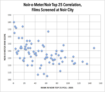
The best I could do right now was use the more easily accessible films in the NC SF master list which are correlated to the old Top 25 poll. That's 77 films from the Top 25 list.
The missing films are all over the poll, as high as #8 (TOUCH OF EVIL) and #11 (THE BIG SLEEP) which haven't been shown at NC SF.
So you are looking at the Top 25 poll fanning out left-to-right, with noir-o-meter raw scores displayed on the vertical axis.
Sometime after the French book is done ("contained" is the firefighting analogy here...!) I hope to fully integrate all of these files, including the NC LA screening list and Elliot Lavine lists so that a more comprehensive look at these correlations can be made.
There is definitely some correlation here, but it's premature to formally calculate it, because so many other films are not represented. The other way to look at this is (as you noted) by the quality rankings of these films vis-a-vis the noir-o-meter scores; I will see if I can get that posted and linked a bit later.
Re: A partial correlation chart [was: Re: High Maltin ratings but not in Blackboard's top echelon]
Posted by Solomon on 1/7/2018, 4:10 pm, in reply to "A partial correlation chart [was: Re: High Maltin ratings but not in Blackboard's top echelon]"
Thank you, Don.
See if you can follow me here on what I see. I see curvilinearity, and it can be dissected.
Look at the 0-20, the 20-40 and the 40-60 portions. By portion I mean the narrow rectangle in each case that sits atop the rank-axis. For 0-20, the meter scores range from 125 to 180. For 20-40, they drop, ranging from 120 to 155. For 40-60, they drop again, from 108 to 155. These 3 blocks will produce a clear positive association between BB ranks and meter scores in the direction one would expect. Voters and meter are on the same page.
After that, the correlation disappears. The relation flattens and becomes horizontal, causing the curvilinear appearance. Although the ranks are getting worse and worse as we move to the right, the meter scores remain stubbornly above 120, with the exception of a 110 score.
I suggest that this is an artifact of the ranks and also the voting, both the number of voters and how the votes could be cast. The ranks between 80 and 140 are NECESSARY. Films that are measured quite highly by the noir meter HAVE to be pushed into worse ranks, because that's all there is after exhausting votes on the higher ranked films.
My suggestion in the prior post of converting the meter scores to ranks won't solve this problem. It'll make the correlation worse. The differences in ranks as provided by the votes and the meter are not really commensurable.
The data suggest the following. Below some voting rank like 60 down to nearly 140, the films there (of which there are about 27) all have about the same quality as measured by the meter (typically 120 to 140), quite high scores, which if they have merit suggests that the worse rankings are an artifact that something has to be rated worse by the voting. The other possibility is that the meter calls a noir a noir at the lower rungs of the ladder but inadequately assesses quality at these ranks. In other words, do we believe the meter or the ranks produced by the voting?
Above some rank like 60 and all the way to 1, the noir-metered score does tend to rise with rank.
This is interesting work. I hope you can turn up some other ranking methods to use the meter against. For example, the IMDb score, or perhaps the scores by some subset of its demographic breakdown. You can always try Maltin's scale which has 7 ranks. You could see if the average meter score within each of the 7 classes rises with Maltin's average. (4, 3.5, 3, 2.5, 2, 1.5 and BOMB) are the 7.
Re: A partial correlation chart [was: Re: High Maltin ratings but not in Blackboard's top echelon]
Posted by Don Malcolm on 1/8/2018, 1:03 am, in reply to "Re: A partial correlation chart [was: Re: High Maltin ratings but not in Blackboard's top echelon]"
I was able to bring over the Quality Scores for those 77 NC SF films, and substitute those values for the Top 25 Poll rankings. This chart shows quality increasing as we go left to right, whereas the first chart showed highest quality at left and decreasing as we go rightward.

Remember that this is about one-fourth of the total data set for NC SF. My sense is that the more data points one has for this, the less pronounced any correlation will be.
Keep in mind that the noir-o-meter measures elements that are not necessarily in all noirs--the most egregious of these in terms of the point system distribution has to do with flashbacks, which only about 20% of all noirs possess.
Readers should recall that the "noir-o-meter" is not meant to assess filmmaking quality, it is designed to capture the presence/absence and relative intensity of noir elements/characteristics in individual films. That there is some correlation in terms of high "noir-o-meter" scores and film quality is certainly possible, but it is mostly coincidental.
Responses